There is a scourge taking over digital design: icons without labels.
You can help put an end to this deceptive practice.
Add a label to your icon. Add labels to all your icons.
Icons without labels
Google Sheets has a toolbar containing 25 icons without labels with a submenu containing 7 more icons without labels.

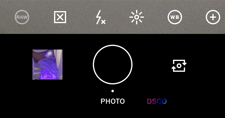
The VSCO app navbar has 6 icons and no labels.
Navbars
Navbars are a common source of icons without labels. Learn more about navbar icons without labels.
Slack uses a search bar to separate its 6 icons without labels.
Toolbars
Toolbars are rife with icons. They rarely have labels. Learn more about the myth of icon usability.

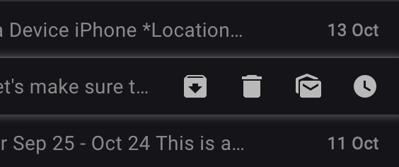
Gmail uses icons without labels for actions you can take on an email only when you hover over it.
Actions
You can often see icons without labels for inline editing actions. Learn more about designing for icon usability.

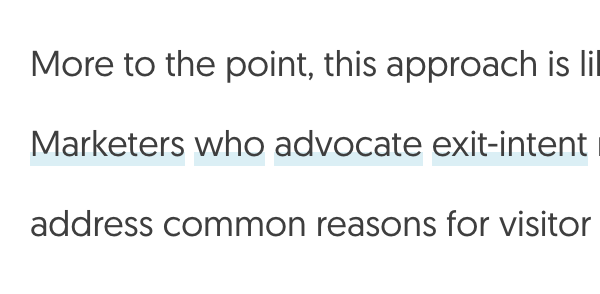
This paragraph has 4 links in a row to non-descriptive places like the word “who”.
Mystery meat navigation
“Mystery meat navigation” describes links that do not have a clear destination. You need to hover over the link to uncover its destination or follow it with wild abandon. Like mystery meat—processed meats with unidentified sources—mystery meat navigation is clear to the creator but not to the consumer.
Icons are not the only kind of mystery meat navigation. Poor link text also confuses readers.
What designers and developers say

The symptoms of mystery meat navigation include decreased click confidence, wayfinding challenges, longer task completion times, and abandonment.
You have to give icons alt text anyway. You may as well give them labels.
—Diana MacDonald, Practical UI Patterns for Design Systems

Interacting with modern software involves poring over inscrutable hieroglyphs trying to find the one button that might do what you want. This button may be buried in a settings menu (which "cog" button is it?), or stuffed into a drawer behind a hamburger button that looks like nothing at all. And you won't find out if it's the right thing until you try.
—Jack, developer and speaker
What can you do?
Use meaningful icons
Icons establish visual language and create visual interest.
Use icons with physical resemblance to signified objects. Reserve outline icons for actionable icon buttons.
Write informative labels
A label is a classifying name that adds clarity and aids navigation.
Write labels that identify objects. Use plain language. Test the readability score of your labels. Use consistent naming conventions. Use the same label for an icon every time.
Label your icons
When you add a text label to an icon, you immediately make the interface more understandable and less bewildering to new users.
If you really must have an icon button without a label, show a tooltip on hover and focus (for people using touch devices, keyboards, or screen readers).
Conduct usability tests
Only use icons without labels when you have rigorous usability testing to back you up.
Make the world a clearer place.
You can make the web a more accessible, inclusive space.
Share the love. When you add a label, tell the Twitter community and spread the good vibes.